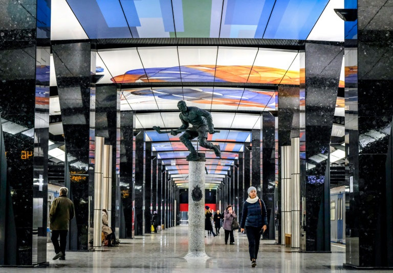
Goodbye Stalin: Moscow metro sheds Soviet look in bold new stations
()
Moscow (AFP) – Moscow’s metro system is famed for its Stalin-era stations with glittering chandeliers and mosaics, but architects are taking a radical new approach as the network undergoes a massive expansion.
While the original stations were conceived as “palaces for the people”, the new designs are less formal with light boxes for seats and laser-printed glass patterns.
In a major break with tradition, the Moscow city government has allowed outside architects to submit designs for several new stations in competitions that included a public vote on a phone app.
It has paved the way for “truly interesting and original stations that are outside any tradition,” says architecture journalist Nina Frolova.
The first of these to open is in the high-rise suburb of Solntsevo, once notorious for its local mafia.
Moscow’s Nefa Architects won with a design inspired by the sun, the Russian word for which forms the root of the suburb’s name.
“We wanted to let the sun inside,” said Nefa’s lead architect Dmitry Ovcharov, surveying the newly opened station on a recent afternoon.
They punched holes in the walls of the station entrances to “create light and shadow”, he said.
Down on the platform, cylindrical white light boxes serve as seats that Ovcharov promises are sturdy enough to withstand passengers’ weight.
This year the transport system, which dates back to 1935, opened 16 new stations and carried around two billion passengers.
– ‘A battle for quality’ –
Frolova, editorial director at the Archi.ru architecture website, said Solntsevo is a bright example of new metro trends.
“There’s a concept that any passenger can see.It feels pleasant being in the station.”
But she said another design competition for the Novoperedelkino station ended less happily, with “significant changes” to the design.
It featured dramatic patterned glass ceilings that ended broken up with ugly seams and “turned out much less interesting than was planned”, she said.
Architect Ovcharov has grumbled about Solntsevo too, pointing out incorrectly printed panels and overhead lights that do not work.
“It was a really unrelenting battle for quality, to get the design decisions complied with,” he said.
Yet he adds that he’s now considering taking part in another metro design competition.
Another architect with a winning station design, Tatiana Leontyeva of Moscow’s Blank Architects, said the prestige of the commission was a draw.
She was part of a team who designed a station called Rzhevskaya, which will have an “archway” theme in a nod to its location near a mainline railway station.
The brief was to create a station for “the new times”, she said, using Russian materials and “without excessive decoration.”
“There was a large number of applications and (the competition) had a big impact, not just on the Russian architectural scene but abroad too because, of course, a lot of people wanted to get their hands on a site like the Moscow metro.”
The historic Moscow metro was a monumental construction in the 1930s, built as an example of quality and solidity, symbolising the grandeur of Stalin and the young Soviet Union.The country’s history was told in the mosaics that adorned the stations’ walls and the metro could serve as a bunker if needed.
– Metro expertise –
Previously the state company Metrogiprotrans had a monopoly on the transport system’s architecture, and it still designs the majority of new stations.
One of its architects recently argued that the company was the only one with the expertise to design the facilities.
“There’s a popular opinion that you can just come along to the metro and draw a picture of a station,” Alexander Orlov said at a recent presentation.
“Even if a drawing of something seems beautiful, it can be incompatible with all the metro technology.”
But Metrogiprotrans is also modernising.
The company’s latest station interiors feature laser-printed designs on glass or glossy aluminium panels, a simple approach that critic Frolova says also works.
“I think they kept a good balance with not many details and some simple, modern forms.”
– ‘Deprived of art’ –
The company is also behind more elaborate stations such as Fonvizinskaya, which depicts characters from the work of a playwright by the same name in ceiling-high 3-D panels.
“I’d never dreamed I’d do the metro,” digital artist Konstantin Khudyakov said.
“That’s monumental art,” said the designer, who explained his work is usually much smaller in scale.
Khudyakov’s stereoscopic panels use the same technology as novelty rulers or pens where figures appear to move — but using many more high-resolution images.
“It’s the first time in the world that this has been done” in the metro, Khudyakov said.
Public reaction to the decor at the station has been mixed.
School teacher Lyudmila told AFP she didn’t much care for the “gloomy” pictures, but was glad the metro system had been linked up to her neighbourhood.
But designer Alexandra, travelling on a weekday afternoon, said she liked the images “purely visually — they’re cool”.
Either way, Khudyakov believes the metro should still be a showcase for decorative art in a city with relatively few galleries.
“There’s not enough art.People are deprived of art…Let there be art at least in the metro.”
Disclaimer: This story has not been edited by Siliconeer and is published from a syndicated feed. Siliconeer does not assume any liability for the above story. Validity of the above story is for 7 Days from original date of publishing. Content copyright AFP.


